 |
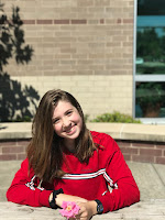
| Before (Sydney) |
For this project, we were assigned a partner to take pictures of and afterwards we had to edit one of the pictures to make it pop art. Here is the picture I decided to transform for this project.
How I began
I knew when researching about pop art that I wanted to make my version colorful. Not only did I want that but I felt that lots of vibrant colors matched the personality of my friend, Sydney. I started by making the picture black and white and after that, I used the quick selection tool to select just her and the table. After that, I made it its own layer to only have her on the screen. Following that, I added a background color which I ended up making it a pretty purple. I complemented the background by adding some shapes and some white splatters using the brush tool.
Design
After finishing the picture, I decided make two more versions but with different colors and backgrounds. After finishing all three, I made them all into a collage. Again, the colors I chose were vibrant to match Sydney and because I feel that "vibrant" is a good way to describe pop art. I also added a filter on Sydney to make her look as if she was painted with dots. This gave it more of a pop art feel, like what many artist in that era did.
 |
| After |


Comments
Post a Comment