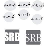
To start making a logo, the first thing you have to start with is sketching. I did about two pages of sketches and when I was done I picked my top two. Once I had a certain concept, I went onto Adobe Illustrator to start making my logo on there. As time went on, I kept adding on to what I designed at first and kept changing different things like the fonts and shapes.
 |
| Original concept |
 |
| Playing around with different shapes and fonts. |


Eventually, I started getting an idea of what I wanted for sure. I kept adding on, but making sure not to add to much. At this point I knew that I wanted to have my shape be a circle but I wasn't so sure about the font style. I wanted my logo to show that I was professional but a circle doesn't exactly show that so I knew that I had to do a classy font. I went with a serif font that looked classy and it could be legible if my logo became small which is something to keep in mind when making a logo.
When I decided on the logo that I wanted to use I added color in my logo. Before we even started sketching, we filled out a paper that asked ourselves what shape, color, and font we wanted to use. I wrote down blue because blue can represent trust which is something that I wanted to incorporate. I played around with different colors like lavender, and yellow. However, every time I looked back at my logo I liked the blue one better.
 |
| Final Logo |
 |
| Add caption |


 Eventually, I started getting an idea of what I wanted for sure. I kept adding on, but making sure not to add to much. At this point I knew that I wanted to have my shape be a circle but I wasn't so sure about the font style. I wanted my logo to show that I was professional but a circle doesn't exactly show that so I knew that I had to do a classy font. I went with a serif font that looked classy and it could be legible if my logo became small which is something to keep in mind when making a logo. When I decided on the logo that I wanted to use I added color in my logo. Before we even started sketching, we filled out a paper that asked ourselves what shape, color, and font we wanted to use. I wrote down blue because blue can represent trust which is something that I wanted to incorporate. I played around with different colors like lavender, and yellow. However, every time I looked back at my logo I liked the blue one better.


Comments
Post a Comment