Analogous
This logo uses the analogous colors of green, yellow green, and yellow. I think the company probably chose these colors because they want to show that their products are natural.

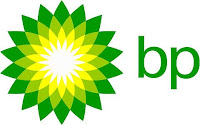
This logo uses the analogous colors of dark green, green, and yellow green. I think the company probably chose these colors because they also want to show that their show has to do with nature and the environment.
Complementary

This logo uses the complementary colors of blue and orange. I think this company probably chose these colors because they wanted the fox to stand out and make it look like fire.

This logo uses the complementary colors of red and green. I think this company probably chose these colors because they wanted the logo and the star to both stand out and balance each others color.
Warm

This logo uses the warm colors of red, orange, and yellow. I think this company probably chose these colors because they wanted their logo too represent warmth and a fire type feel.

This logo uses the warm colors of red, orange, and yellow. I think this company probably chose these colors because they also wanted to give a warm feel just like restaurants and fast food places do.
Cool

This logo uses the cool colors of blue and violet. I think this company probably chose these colors because they wanted to make you think of ice and the cold.

This logo uses the cool colors of blue and green. I think this
company probably chose these colors because they wanted to make you think of ice and mint, since they are a toothpaste company.
Monochromatic

This logo uses the monochromatic color of blue. I think this company probably chose these colors because they wanted 'Ford' to stand out against the blue background.

This logo uses the monochromatic color of grey. I think this company probably chose these colors because they wanted the logo to look like metal or steel, just how it would look like on a car.
Traid Color

This logo uses the triad colors of red, blue, and yellow. I think this company probably chose these colors because the yellow and red is supposed to represent a hamburger and the blue is put in to compliment the other colors.

This logo uses the triad colors of red, blue, and yellow. I think this company probably chose these colors because the red and blue probably represents America and the yellow makes the logo stand out.


Comments
Post a Comment